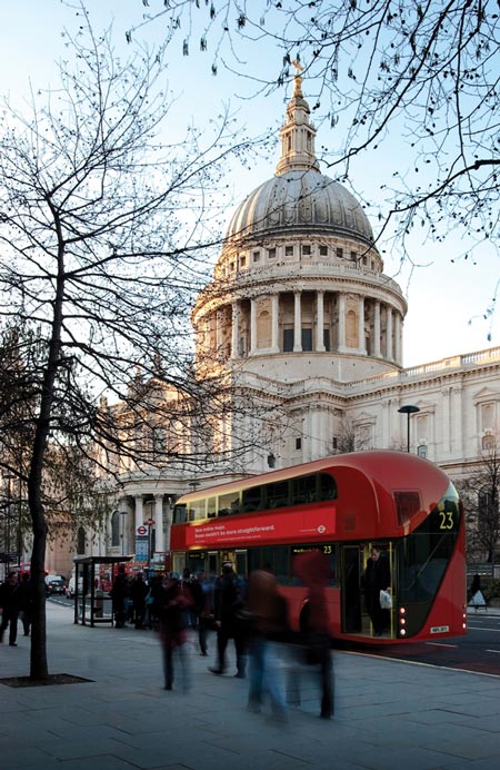
It's a big week for transit and sustainable cities in New York Time's T magazine. No less than five different travel and transportation innovations were mentioned in this travel issue. Teague's barebones stripped-down vision for high fuel efficiency flying - labelled Flight 2.0. A nod at Inspiro, BMW Group DesignworksUSA exciting new subway train design for Siemens. Joey Ruiter's Inner City unchained unicycle-based back-to-basics bicycle. Priestmangoode's double-decker bullet Mercury Train. And Thomas Heatherwick's modern icon for an old one - a replacement for London's classic, red open-platform, Routemaster double-decker buses. Woohoo.
Our creative for Züm, Brampton's new rapid transit service is on the road and in the press with some very positive attention - and in the Toronto Star and the Metro. As we like to say, we just make ideas. It's the ideas that make the news.
Take a look at the Star article by clicking here.

Or take a gander at these ads to see what all the fuss is about.


Article and blog, copyright Gavin Barrett 2010.

Creative Commons Licence
This work is licensed under a Creative Commons Licence.


So is this what it's coming to?

Because we can't convince people to choose buses over their cars, we'll just drive buses over them cars!

Yee haaa!

via @huffingtonpost: China Plans Huge Buses That Can DRIVE OVER Cars. No, it's not a monster bus derby. http://huff.to/a3ZDUx
This little low-budget video has probably done more to promote ridership on transit than many rubbishy advertising campaigns.

Enjoy.


Dating Humor:
How To Chat Someone Up On The Train, Bus Or Tube

How To Chat Someone Up On The Train, Bus Or Tube (Love & Dating: Dating Humor)


A simple smart advertising campaign can go a long way towards converting drivers to riders.
Luck led me to this posting on sustainable urban transportation blog, The City Fix.

One campaign in particular caught my eye - the comparative, good vs. bad, cars vs. buses Go Metro ads made their point with clarity and immediacy. I went hunting for the rest of the campaign and found a treasure trove at another blog Long Winded and Proud.

Check out the Naughty vs Nice t-shirts they distributed to baristas - a lovely grassroots touch.

Images via The City Fix and Long Winded and Proud.
Article and blog, copyright Gavin Barrett 2010.

Creative Commons Licence
This work is licensed under a Creative Commons Licence.


Züm is Brampton Transit's new bus rapid transit brand, carefully developed through a year-long process that included stakeholder interviews, best practice reviews and town council approvals. Appropriately enough for a transit service, Züm has an origin and a destination. Züm began its journey in the idea of a speedy, urban, world-class, rapid, modern, forward-looking, cosmopolitan rapid transit system. Züm sounds like zoom, the sound of something moving fast, something speedy. Zoom also means to move closer in, to zoom into something for a close-up. Züm’s graphics evoke speed, linkage, modernity, world-class, a certain euro-style sensibility.

Client: Sue Connor, Kim Moser, Brampton Transit
Agency: Barrett and Welsh

Designer: Rob Segovia

Creative Directors: Gavin Barrett and Mike Welsh.
Art Director: Mike Welsh

Writer: Gavin Barrett


For years, I've been shouting (I believe that's the polite word) into the wind that we need to create a movement of transit supporters. It's only when riders who care passionately are recognized, thanked and recruited that true conversion really happens. Well here's a start from Montreal (Thank you for showing us the way). This beautiful little papermation video for Montreal's public transit system, the Société de Transport de Montréal is 1 part cheerleading, 1 part exhortation, 1 part acknowledgement, and all parts the joy of the journey. The video is supported by a series of graphic poster-style ads that make it an elegant, fun campaign. Well done Montréal!

Video made by Karim Zariffa, assisted by Pascal Brousseau for Sid Lee agency.
Photography by Simon Duhamel.

Article and blog, copyright Gavin Barrett 2010.
Creative Commons Licence
This work is licensed under a Creative Commons Licence.


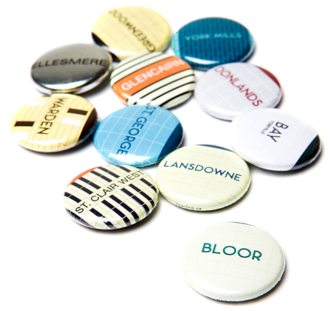
Are Torontonians lucky to have the TTC? Or is it the other way around? In 2005, Spacing magazine introduced a series of buttons commemorating Toronto's subway lines - featuring tiles and type unique to each of the stations. Believe it or not, the TTC actually opted not to market these pins. The TTC's loss was the city's gain. Smart, hip and city-proud these buttons show Toronto at its best: in the hands of its citizens. Available at Swipe books.

Popular Posts

Powered by Blogger.

Plagiarism Watch!